An editorial platform for a culture and technology magazine. Built for fast reading, clean typography, and publishing without the friction.
website design
art direction

We partnered with Vertex Studio to reposition their brand into a bold, modern identity that reflects their creative ambition and strategic mindset.
Client
Echo Vision
Year
2026
Industry
Creative Agency
Scope
Digital Presence

The Challenge
Koven Studio had a solid portfolio but lacked a clear, consistent brand voice. Their visual identity felt fragmented and didn’t fully represent the quality or direction of their work. The challenge was to create a brand system that feels confident, scalable, and unmistakably modern.
- Inconsistent brand expression
- Lack of a clear positioning
- Visual identity didn’t match the quality of work
Difficult to stand out in a crowded creative market
Strategy & Approach
We started with deep discovery — understanding Vertex Studio’s vision, values, audience, and long-term goals. Instead of jumping into visuals, we focused on:
What the brand should stand for
- Who it is speaking to
- How it should be perceived
Brand Positioning
Koven Studio positions itself as a thinking partner, not just a service provider.
The brand needed to communicate:
Confidence without arrogance
Creativity grounded in strategy
- A modern, professional mindset
The Solution
We created a flexible and future-ready brand system designed to bring clarity and confidence to Koven Studio’s identity. Instead of focusing on surface-level visuals, the solution was rooted in structure, consistency, and intent — ensuring the brand could communicate clearly across every touchpoint.
Key elements include:
- Inconsistent brand expression
- Lack of a clear positioning
- Visual identity didn’t match the quality of work
Difficult to stand out in a crowded creative market
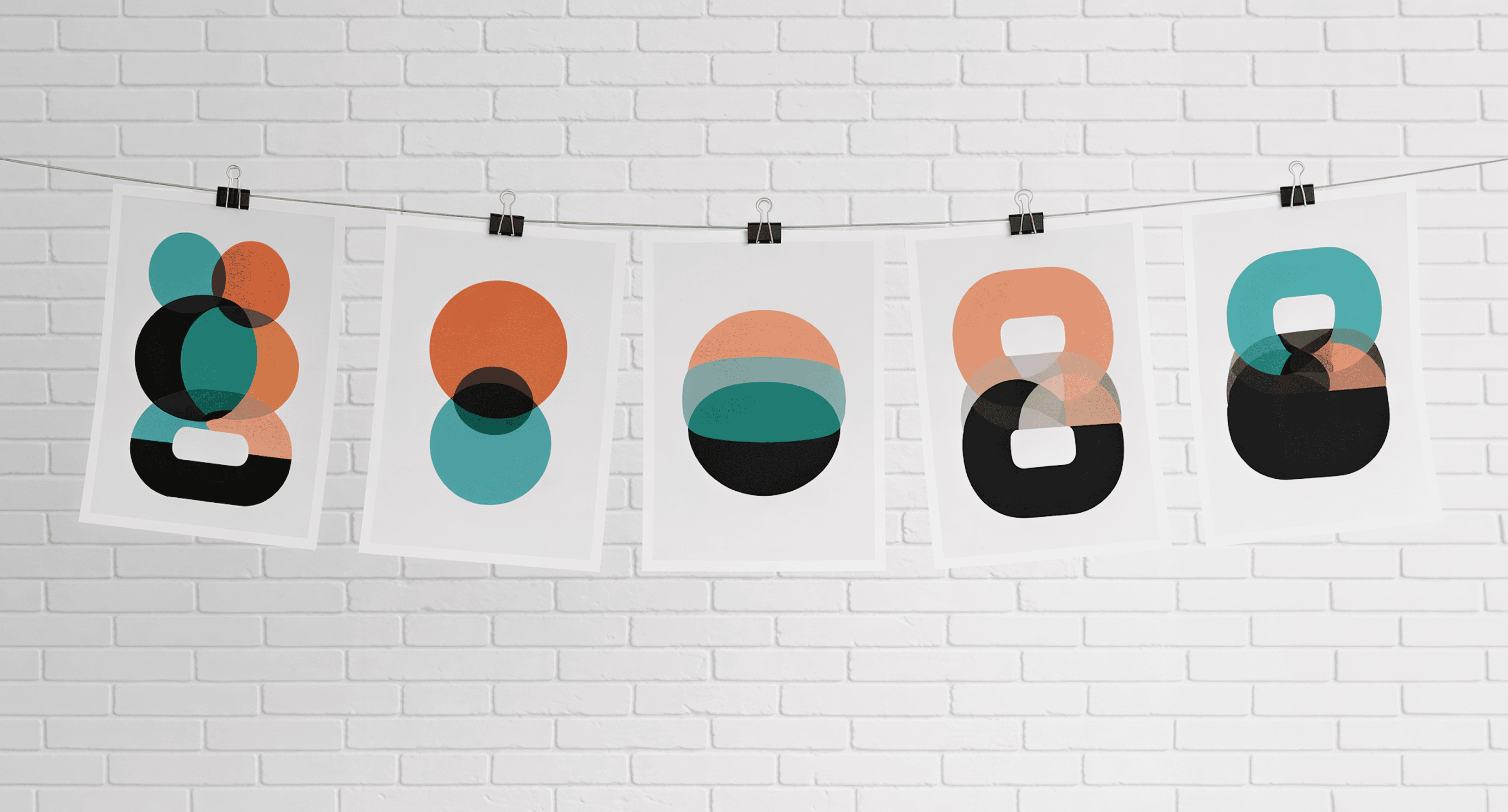


Responsive Experience
Creating a responsive, device-agnostic interface was a central priority throughout the project. With users accessing the platform from a wide range of screen sizes — from desktop monitors to tablets and mobile phones — we adopted a mobile-first design philosophy. All components were developed with fluid grids, flexible containers, and dynamic breakpoints to ensure seamless rendering on every device. Extensive testing was done across modern browsers, OS types and real-world devices to validates the performance, layout integrity, and user experience. We also optimized page speed and UI responsiveness using techniques like lazy loading, minified assets prefetching The result: a smooth, accessible experience no matter how or where the user engages.
Conclusion
Every project teaches us something new. With [Client Name], we learned the importance of blending strategy with creativity — crafting not just a beautiful brand, but a meaningful experience that connects with real people. This project reaffirmed our belief that design is most powerful when it solves problems and tells a story.


